Fazer brand visual identity & packaging design renewal

One brand to rule them all

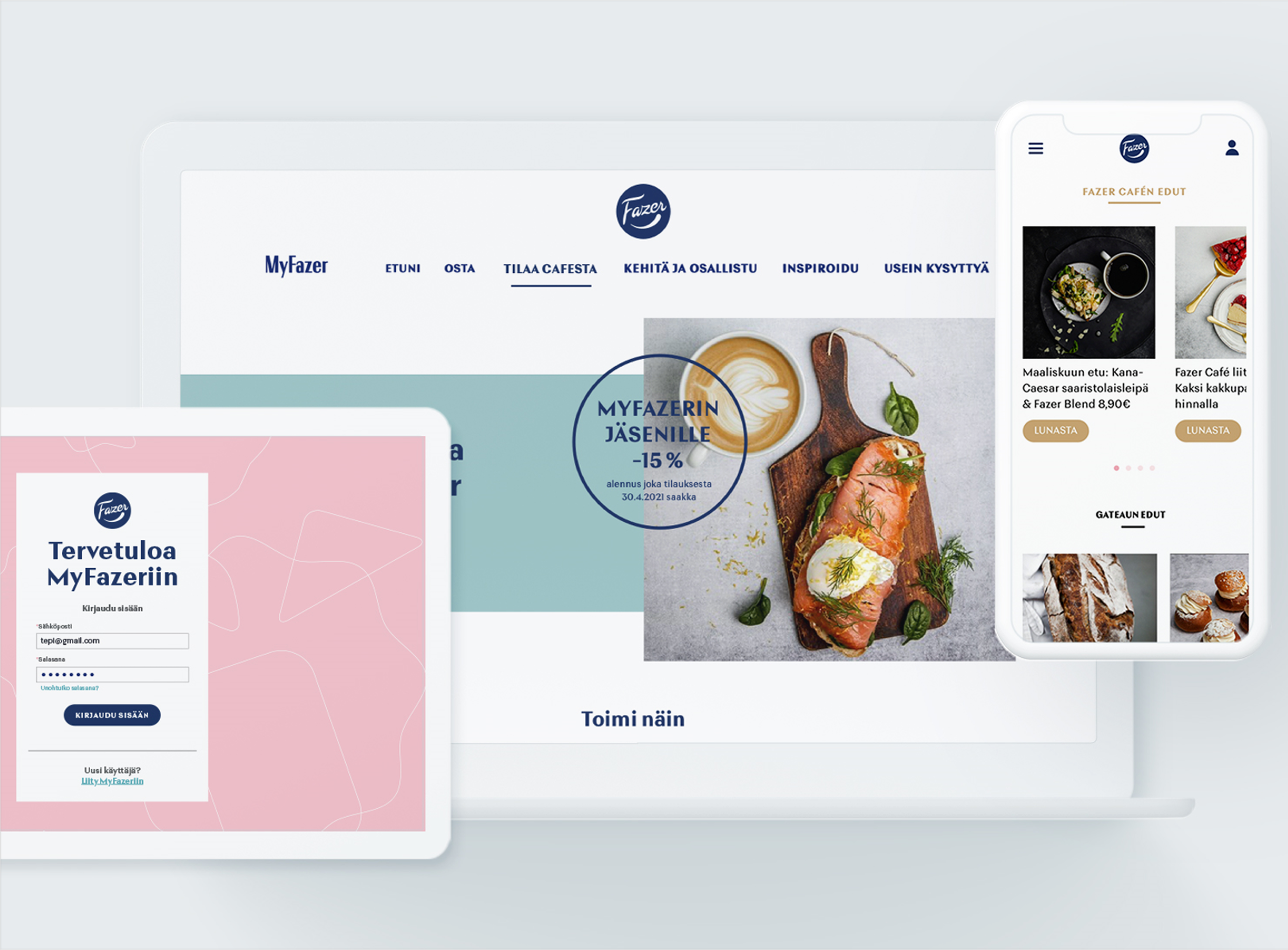
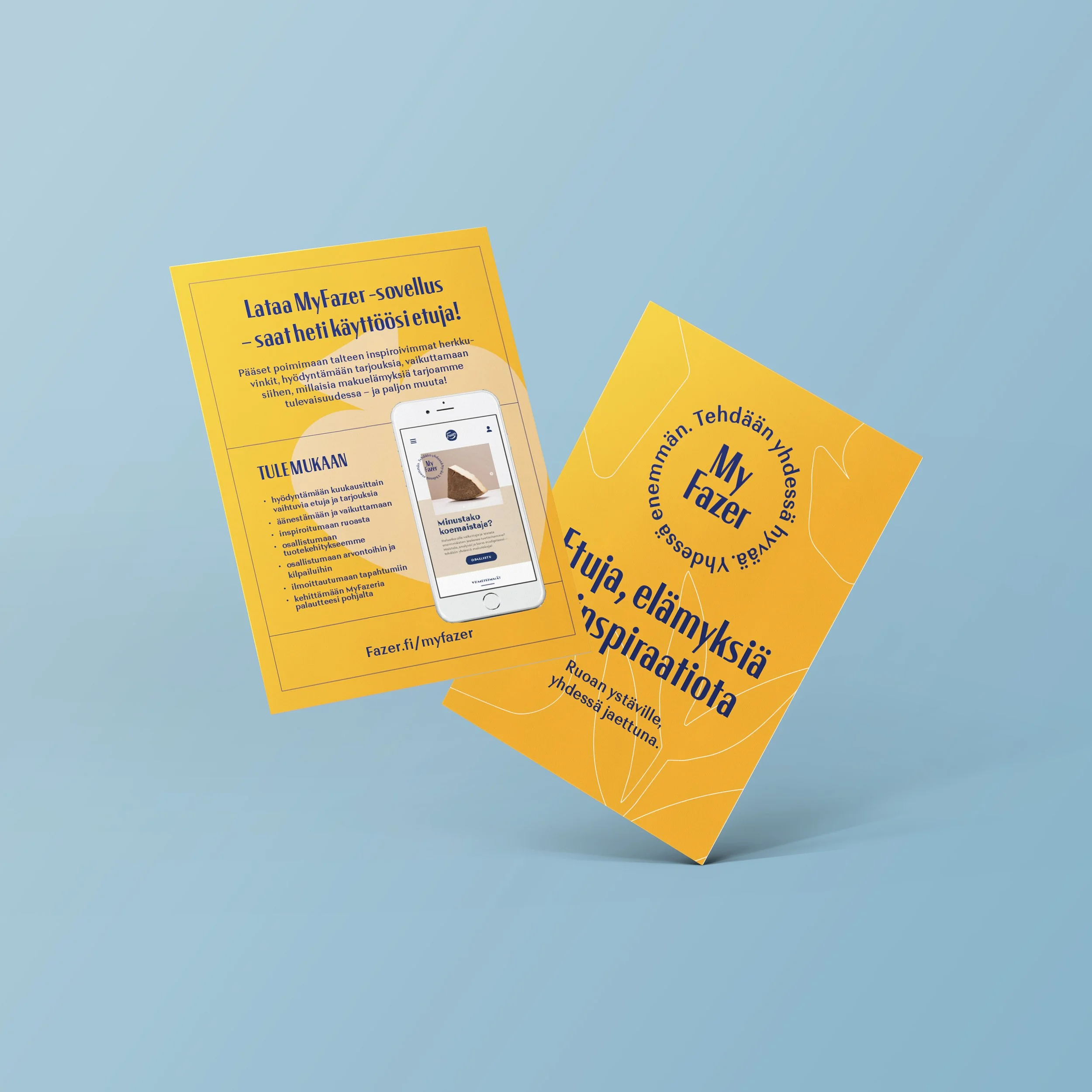
I worked as the lead designer at Pentagon Design in the renewal of Fazer's brand and visual identity. In line with Fazer's new strategy, the role of the parent brand had to be strengthened in product development and communication.

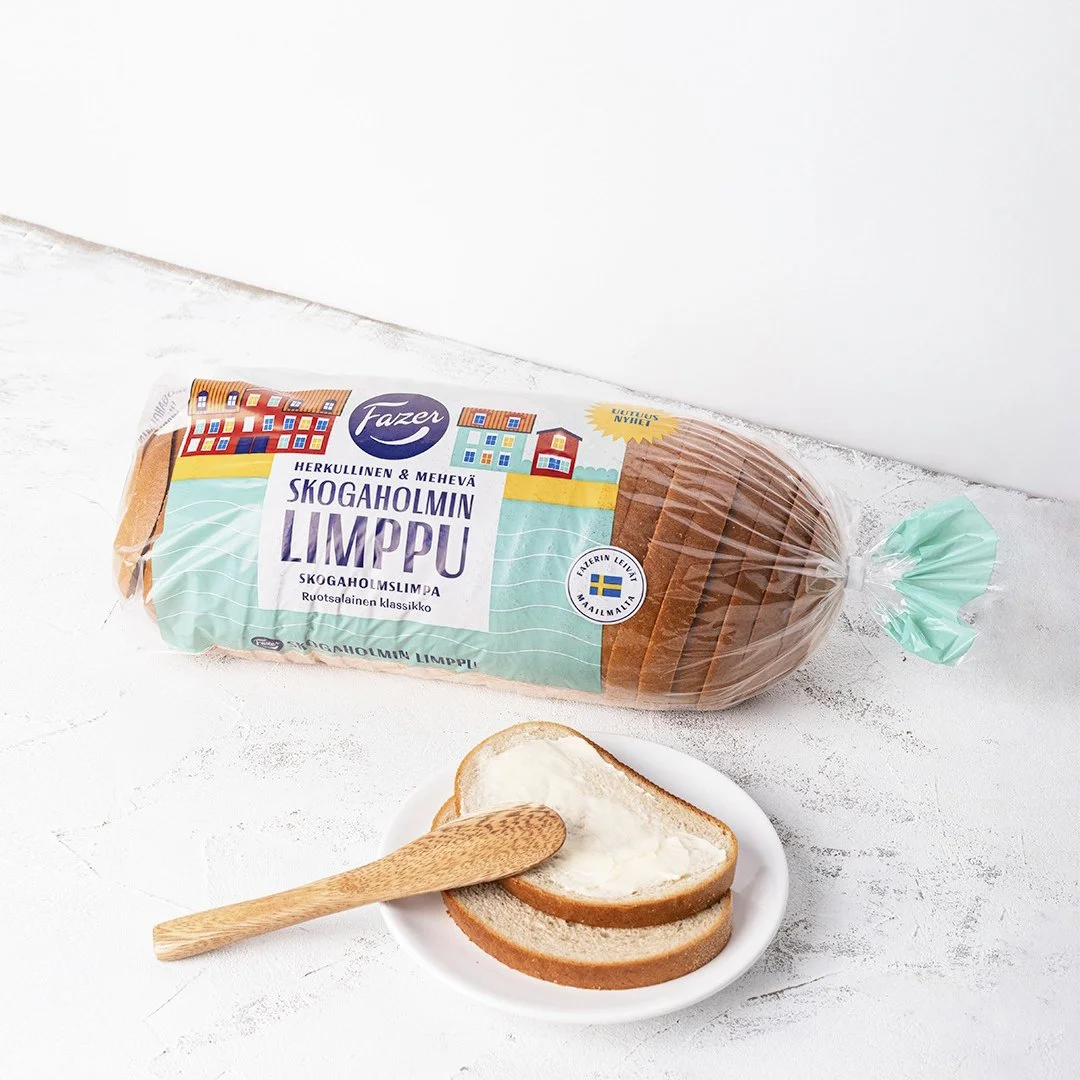
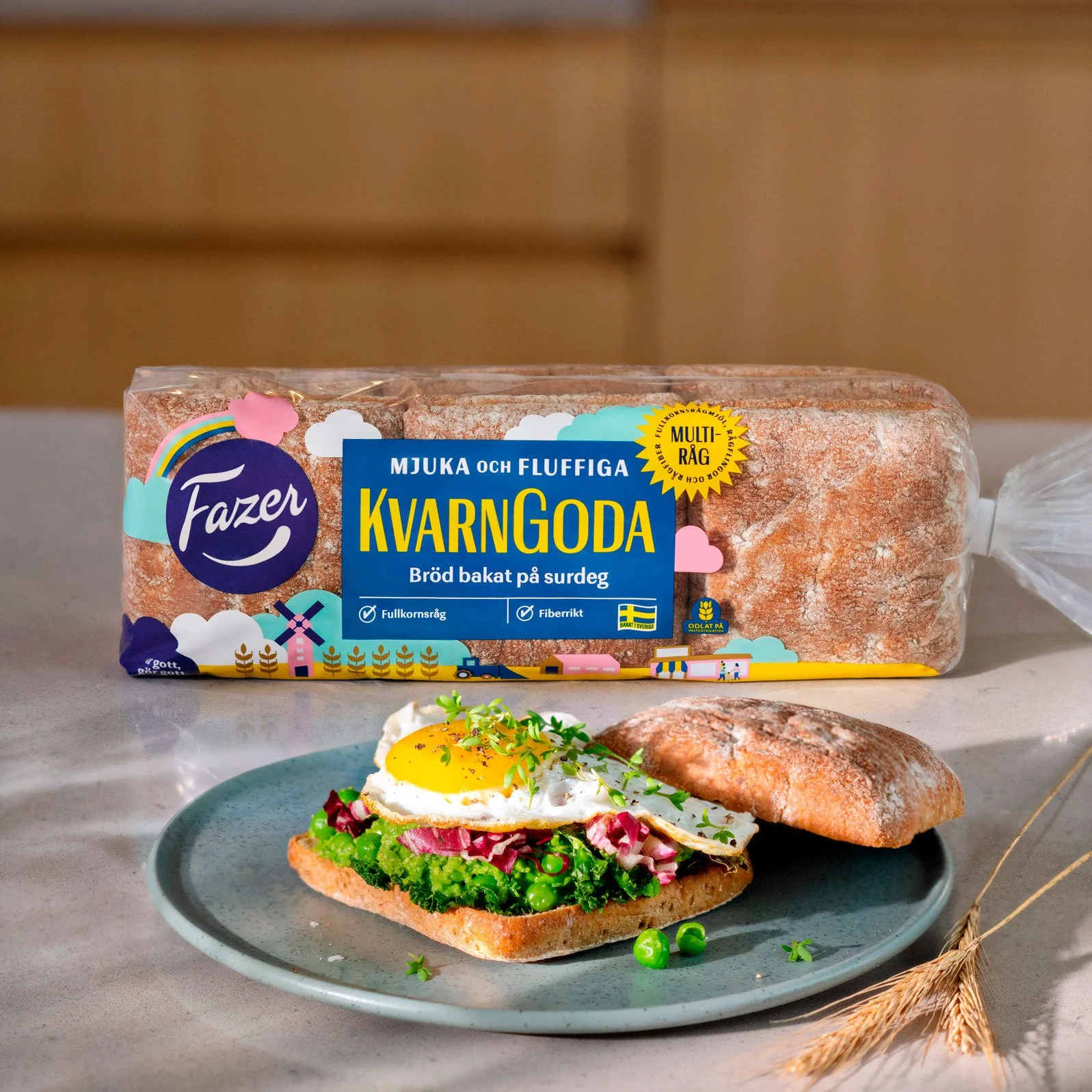
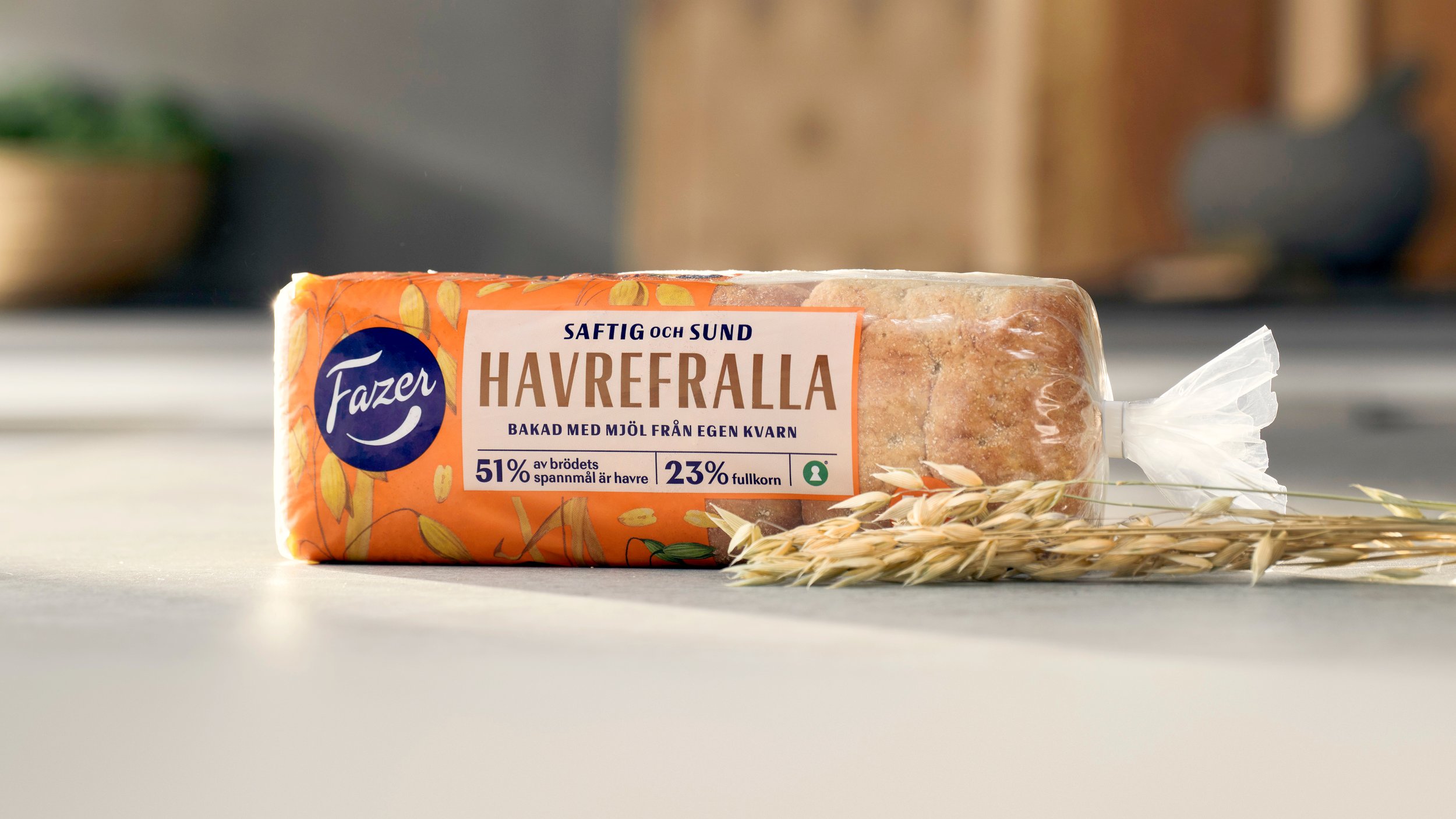
The renewal of the identity created a stronger and more lovable visual identity for the parent brand, as well as a completely new packaging design concept for the it.
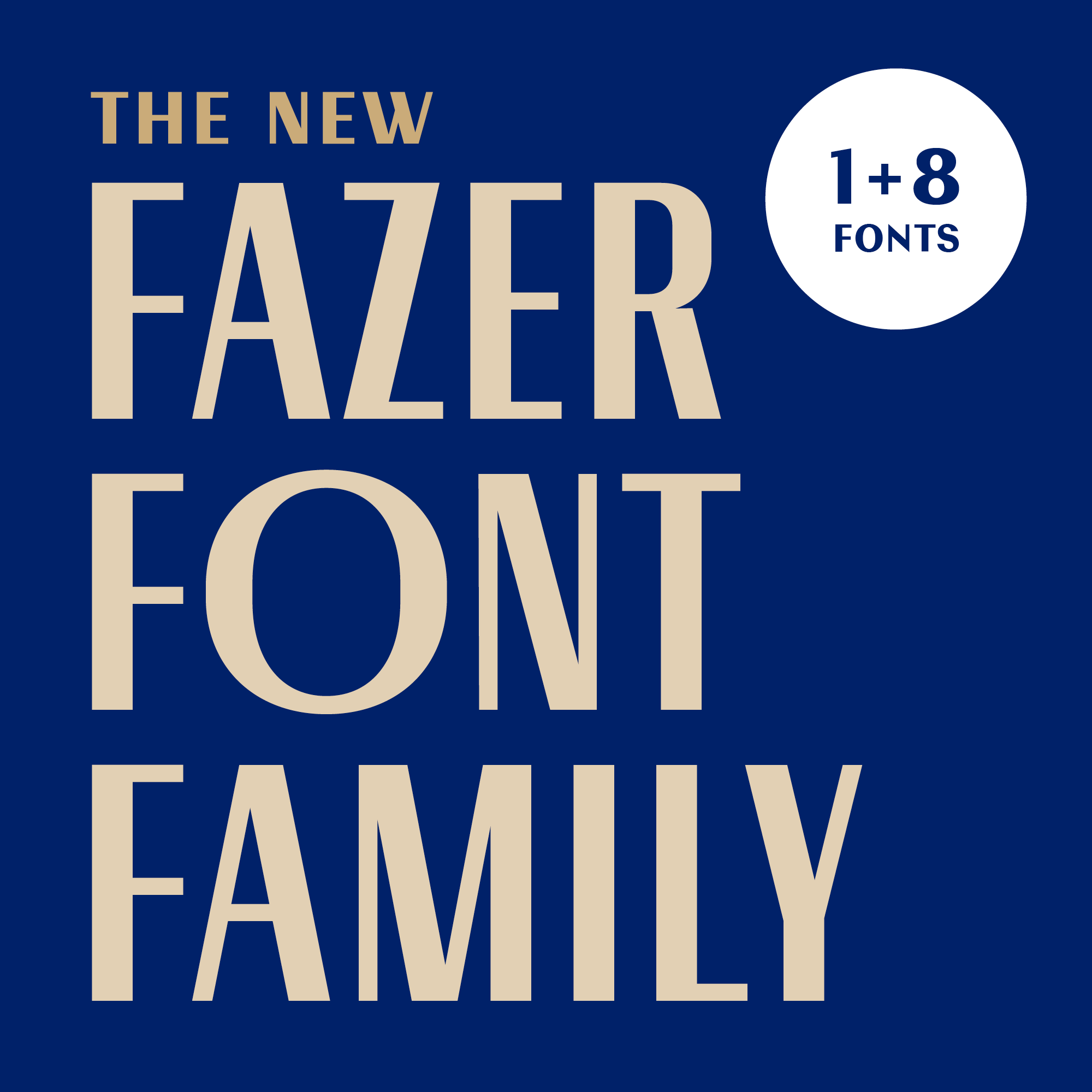
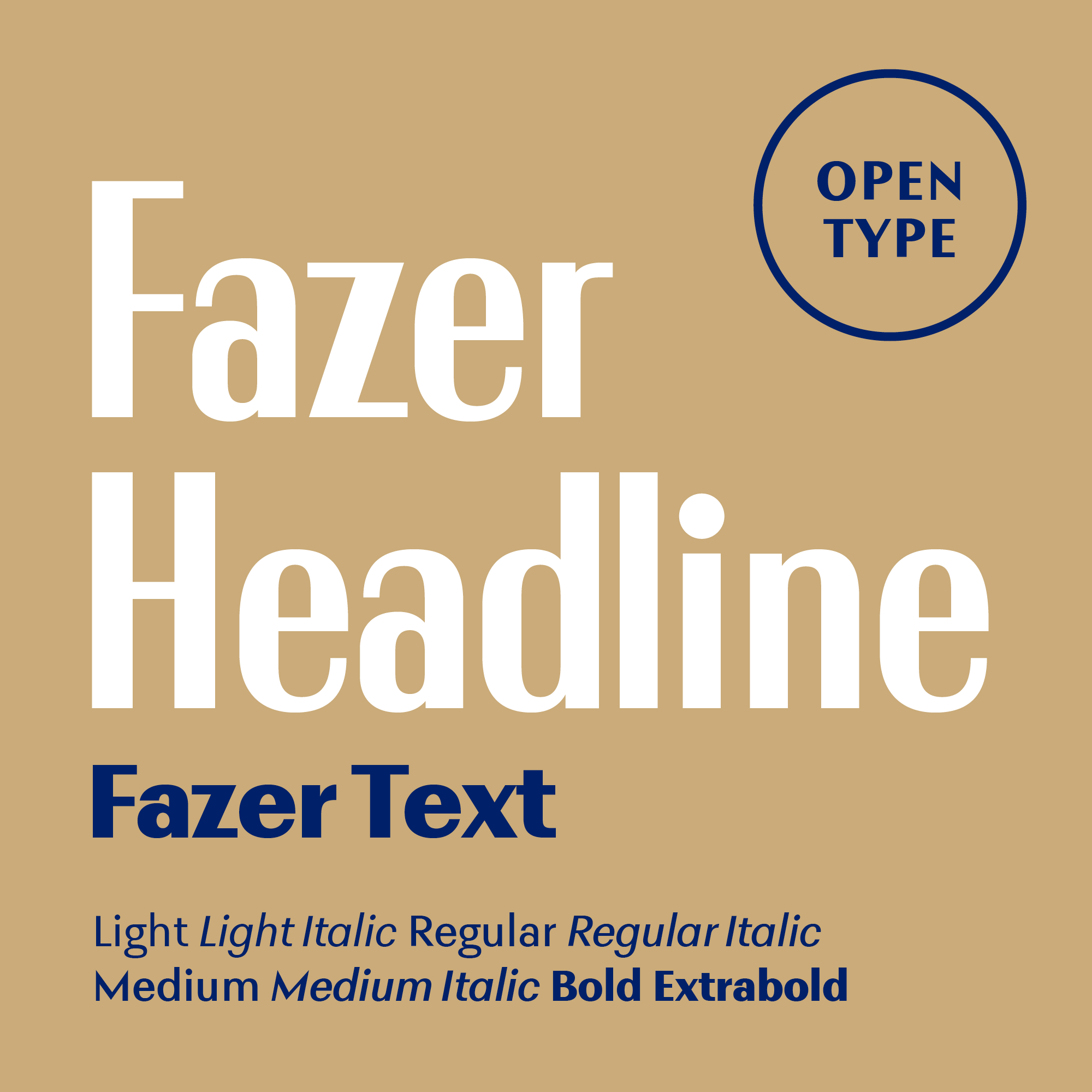
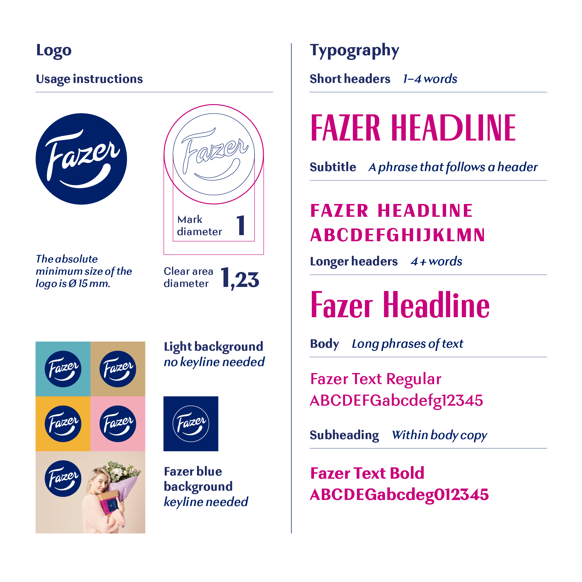
Unique typography

At the heart of the visual identity is the font family that I designed for Fazer, in collaboration with Teo Tuominen.
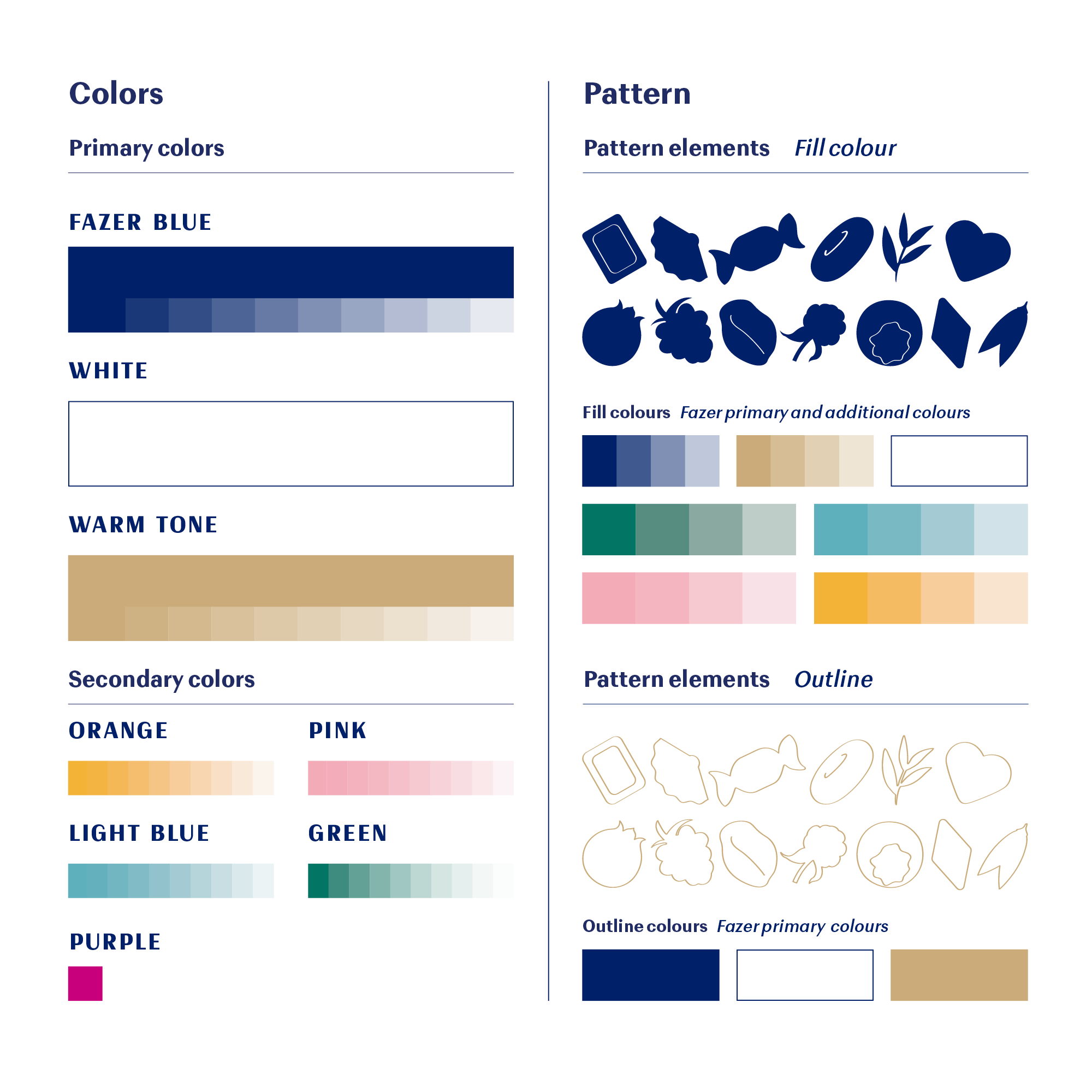
Book cover titled 'The New FAZER FONT FAMILY' with a blue background and beige text indicating over 1+8 fonts included.
Design showing font styles and examples with large white text "Fazer Headline" and smaller blue text "Fazer Text" on a beige background, with additional style descriptions at the bottom.
An infographic demonstrating logo and typography design guidelines for 'Fazer'. It includes logo usage, color schemes, and various font styles and sizes for headlines, body text, subheadings, and subtext, alongside sample logo images and background color variations.
Color chart with swatches and pattern elements, including various colors like blue, beige, green, pink, orange, purple, and light blue, along with line outline patterns of fruits and leaves.

Packaging Design

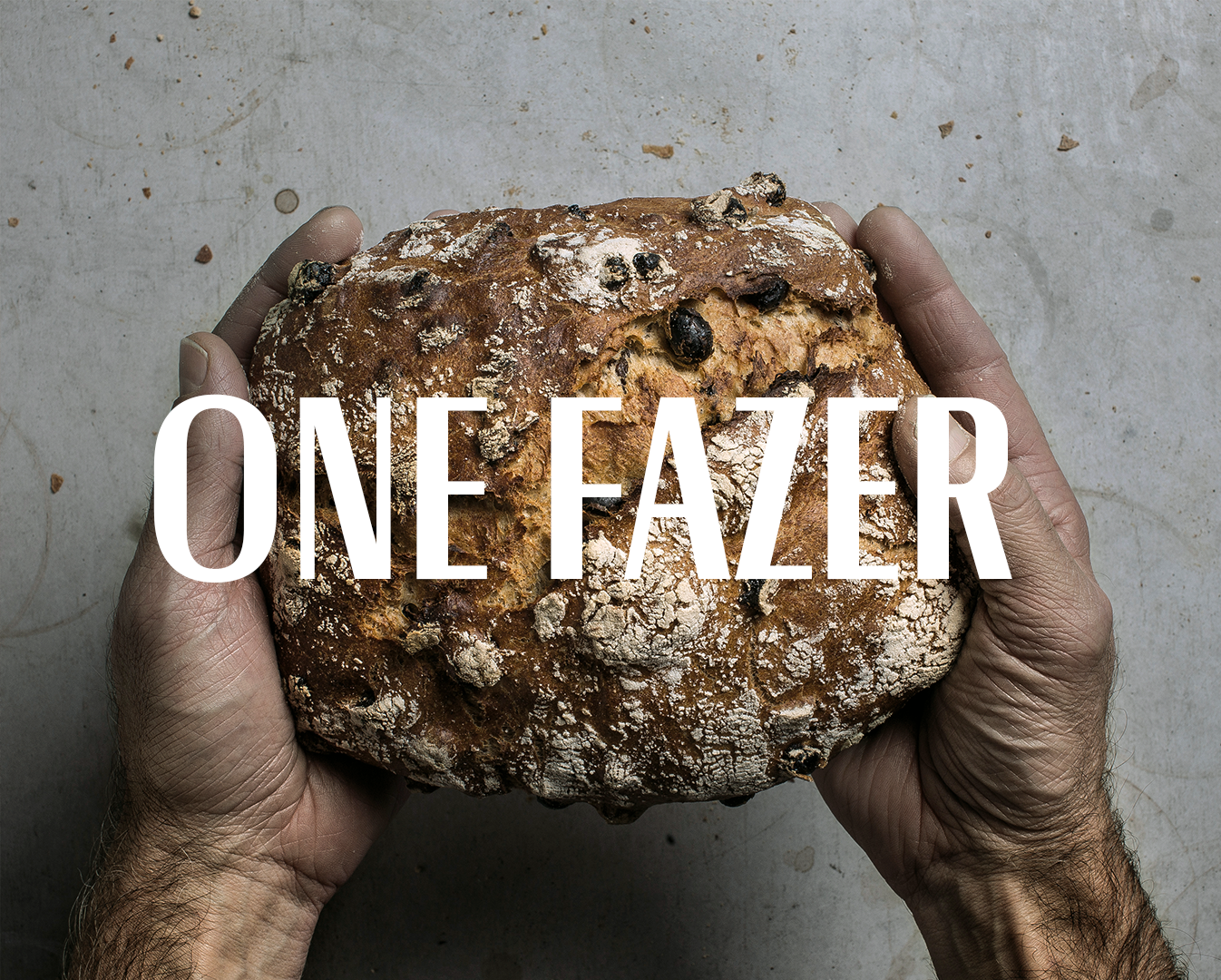
I worked as the lead designer on the new unified packaging design concept for the parent brand, which will be applied to all product groups.
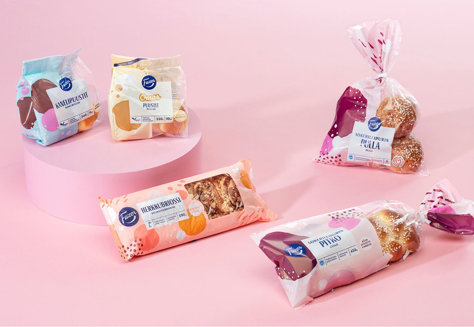

Package of Swedish bread slices on a white surface with a small white plate of bread slices and butter, accompanied by a wooden butter knife.
A plate with a sandwich containing a fried egg, green peas, and pink pickled onions on a slice of Kvarngoda bread. In the background, there's a loaf of Fazer Kvarngoda bread in packaging.
A loaf of Fazer Havref ralla rye bread with oat flakes on top, placed on a white surface, with wheat stalks beside it, in a kitchen setting.
Assorted packaged baked goods on a pink background, including muffins and sweet bread.

Design: Katri Stolt

Screenshots of a website and app login page for Fazer, a Finnish food company. The website shows a promotion for a 15% discount for members, with a food image of a rolled meat dish garnished with herbs, along with menu options at the top for benefits, shopping, ordering, creating a cafe, and inspiration. The app screen displays a cafe's menu with images of dishes and desserts.
Yellow flyer and card promoting My Fazer software, featuring a mobile app image and Finnish text about benefits and user engagement.

Credits


Project and client management: Virva Haltsonen

Lead designer, type designer: Erik Bertell

Designers: Katri Stolt, Juha-Tuomas Reinikainen, Teemu Lehtiö

Illustrator: Erik Bertell, Katri Stolt

Font design implementation: Teo Tuominen

Animation: Saku Partamies / Vibrant Nordic