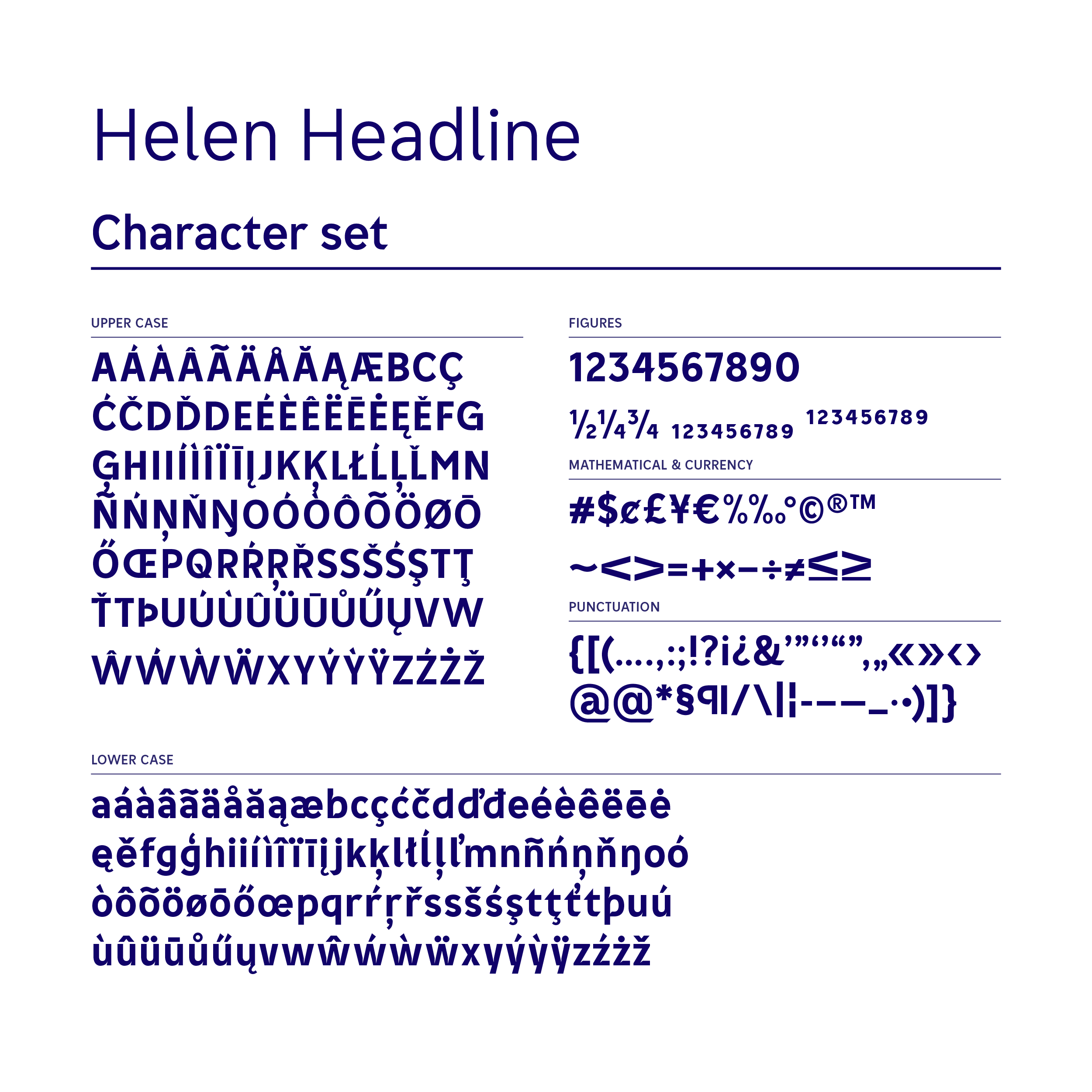
Helen font family
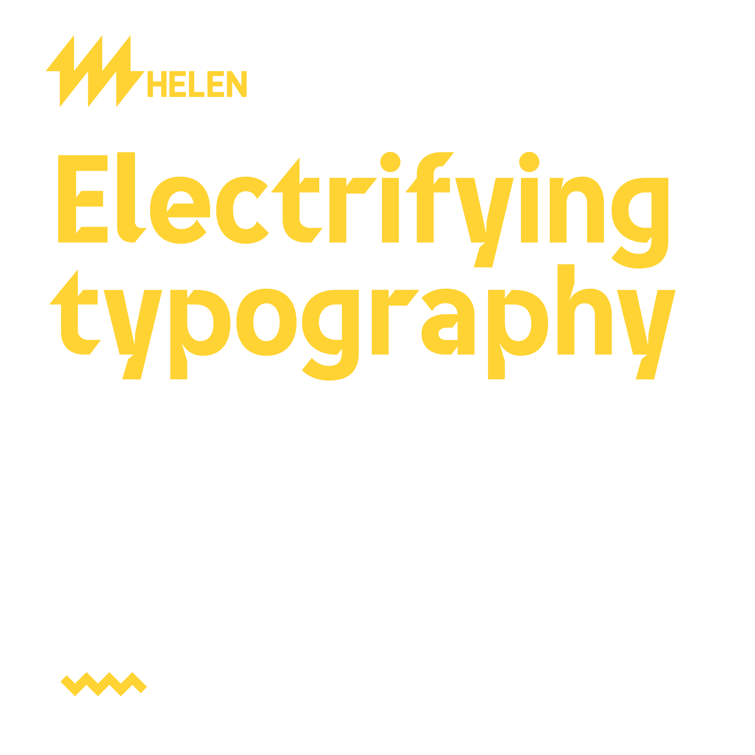
Electrifying typography
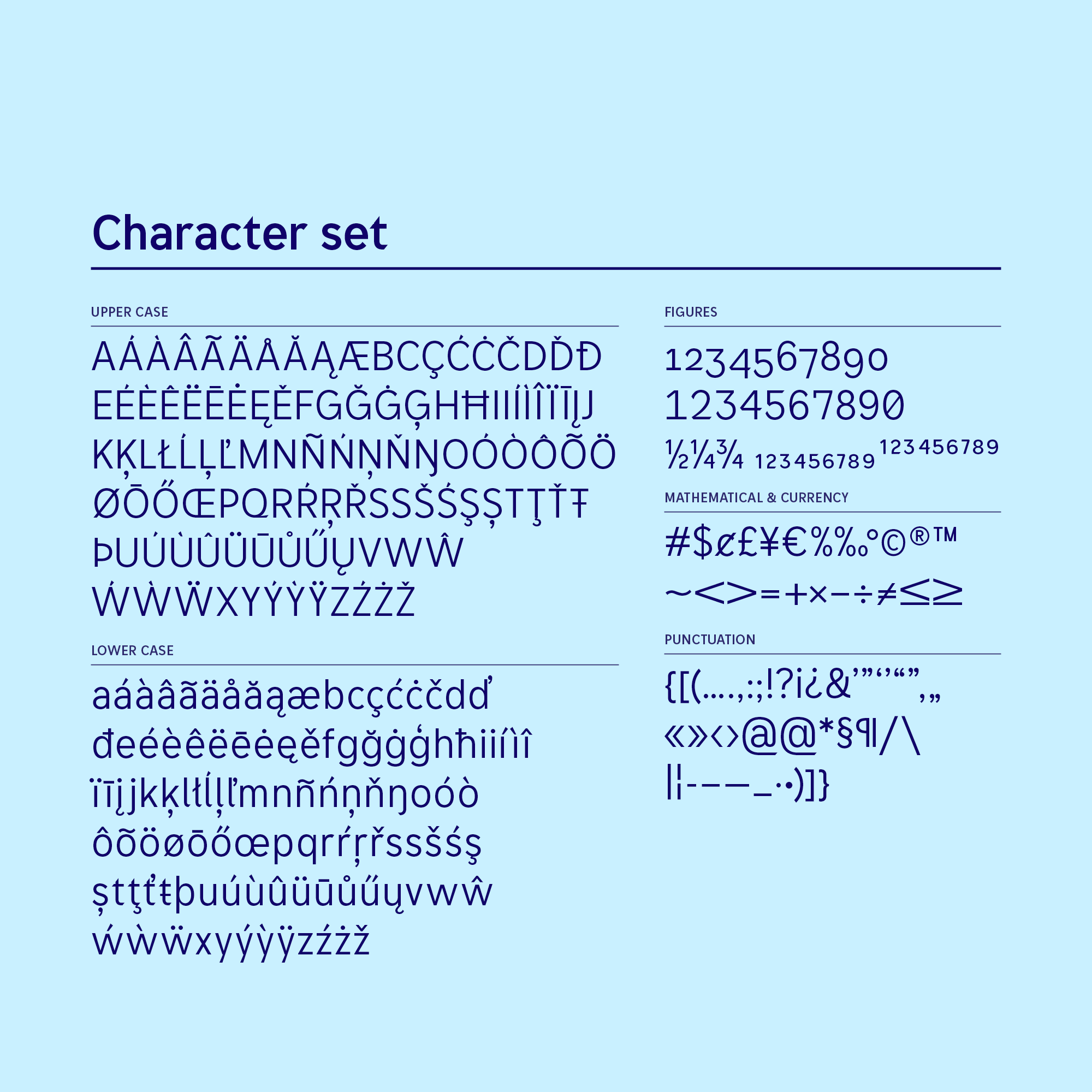
Helen needed a comprehensive font family for the entire group. This was not only aimed to save costs, but also to improve manageability and create a more cohesive brand experience.
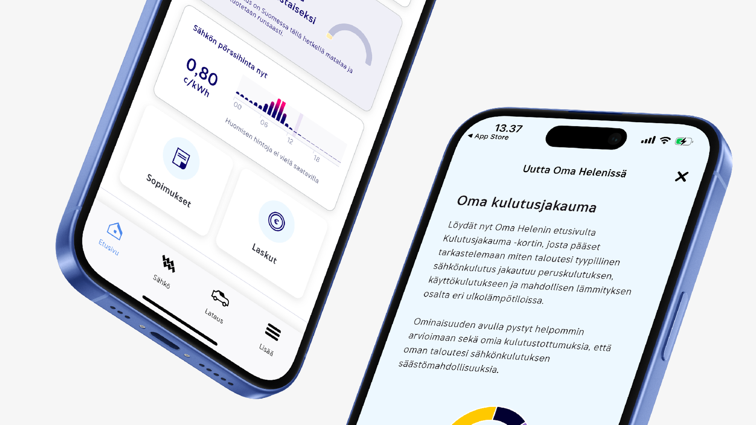
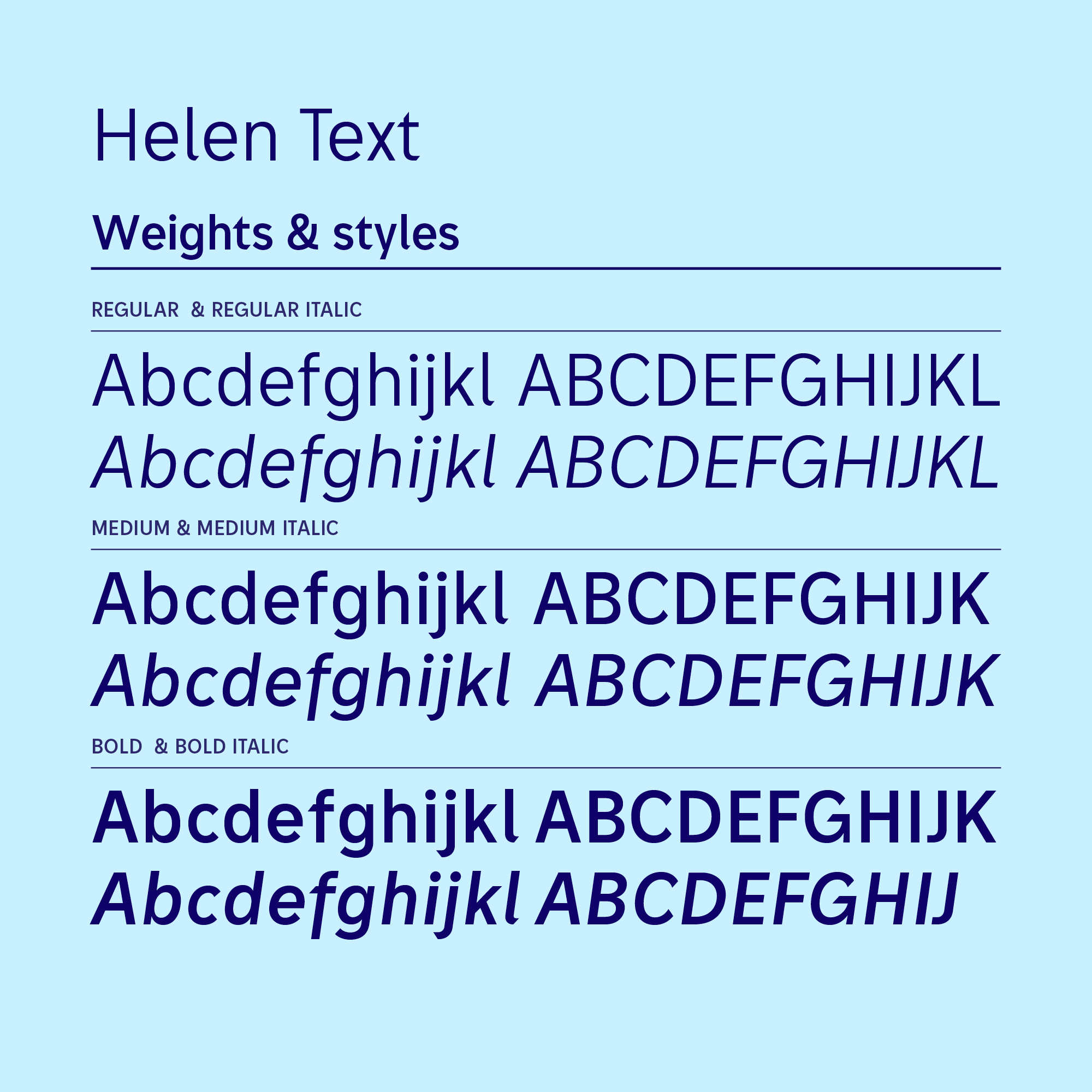
I designed and implemented a font family that consists of an impressive headline font and an easy-to-read, yet distinctive body text font family.
The design language of the fonts echoes the edgy design language of Helen’s iconic symbol.


Credits
Agency
Pentagon Design
Lead designer, type designer: Erik Bertell
Client & Project lead: Tuomas Rentola