Hesburger design renewal
Making an icon of Finnish fast food even more iconic
Together with Hesburger, we designed a new look for their packaging and branding materials and created a new custom typeface family.
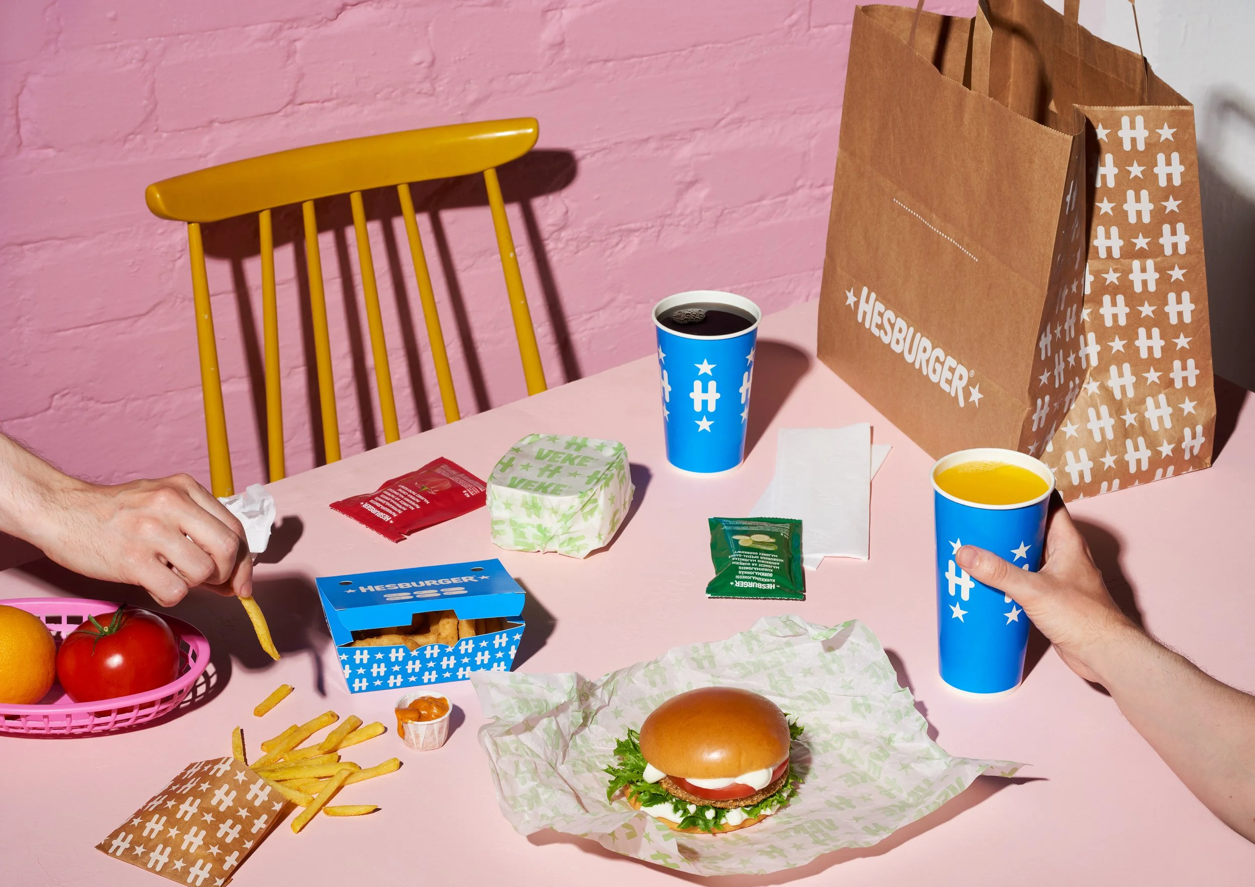
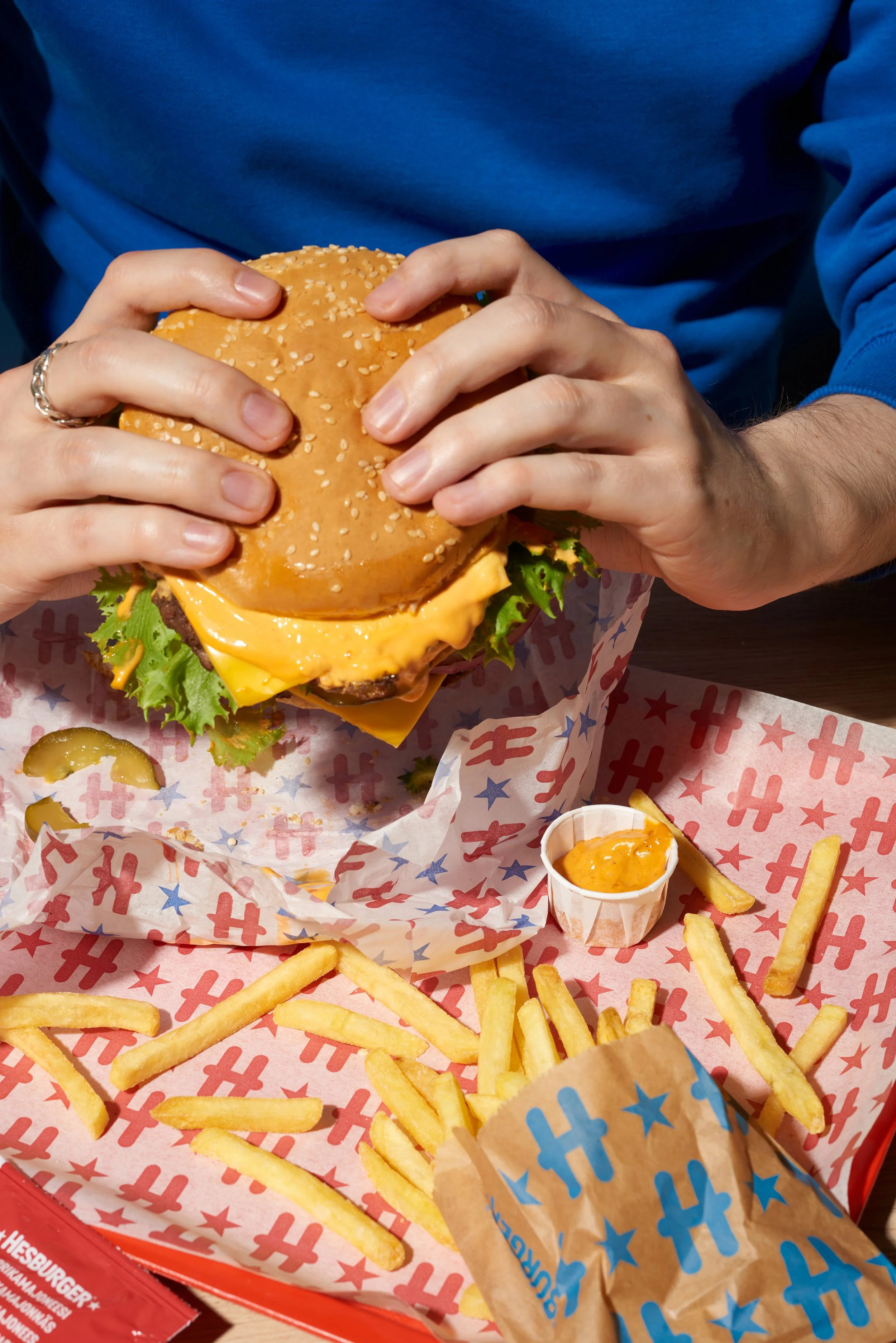
The goal was by no means a revolution, quite the opposite – keep what works and make the whole package simpler, bolder, more consistent and instantly recognizable.
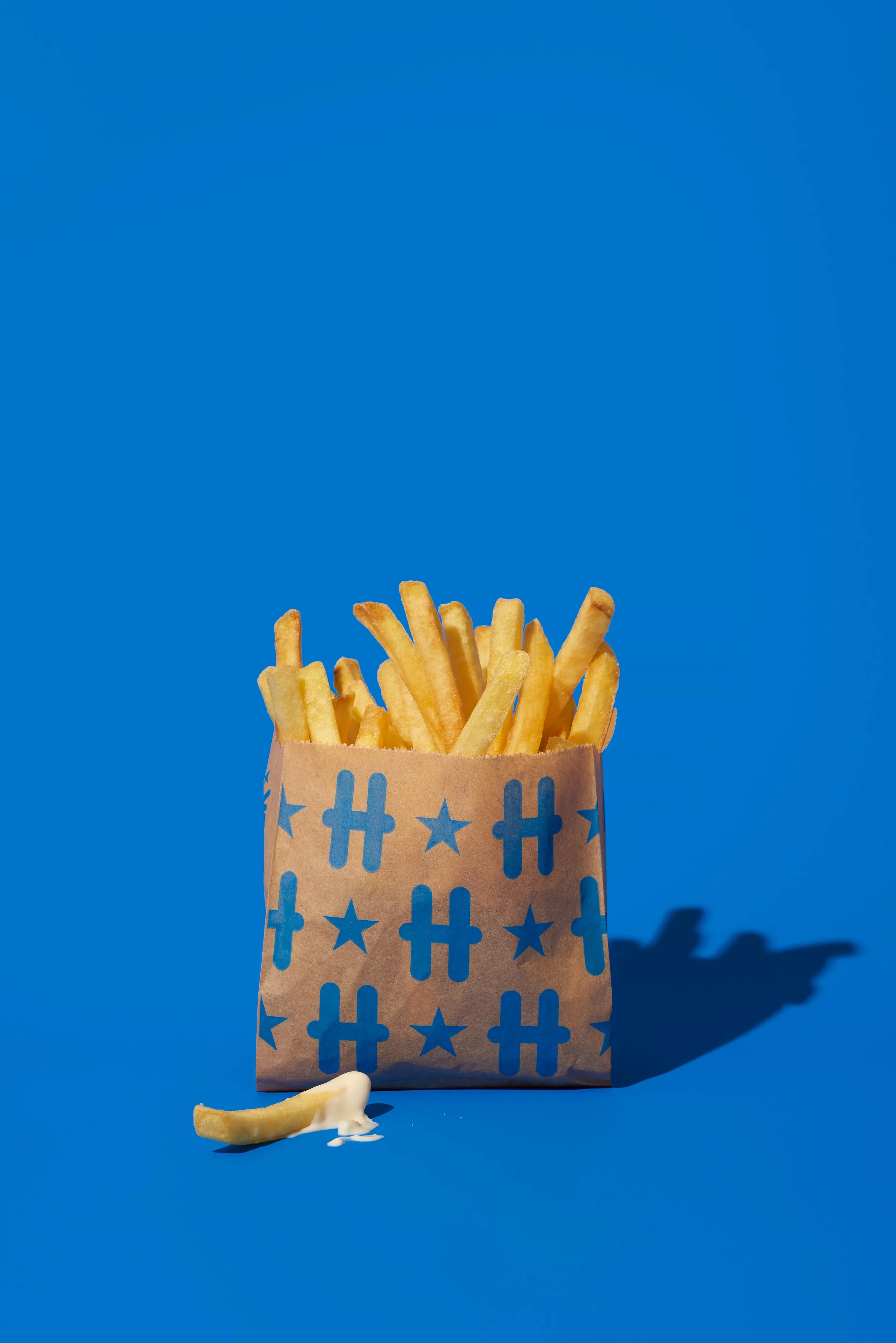
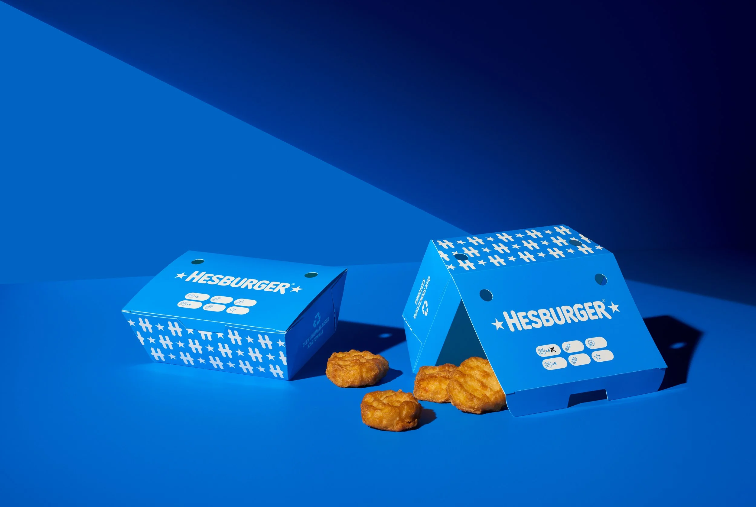
The new look achieves this by claiming the blue color, bringing the fine-tuned H-monogram to the fore – while extrapolating it into a signature pattern, and keeping the overall design as simple as possible. To facilitate the user experience, a comprehensive icon library was designed to communicate different products, flavors and ingredients.
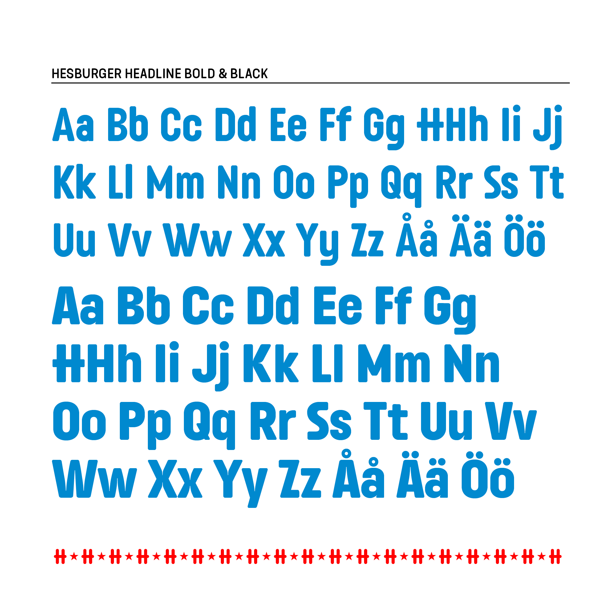
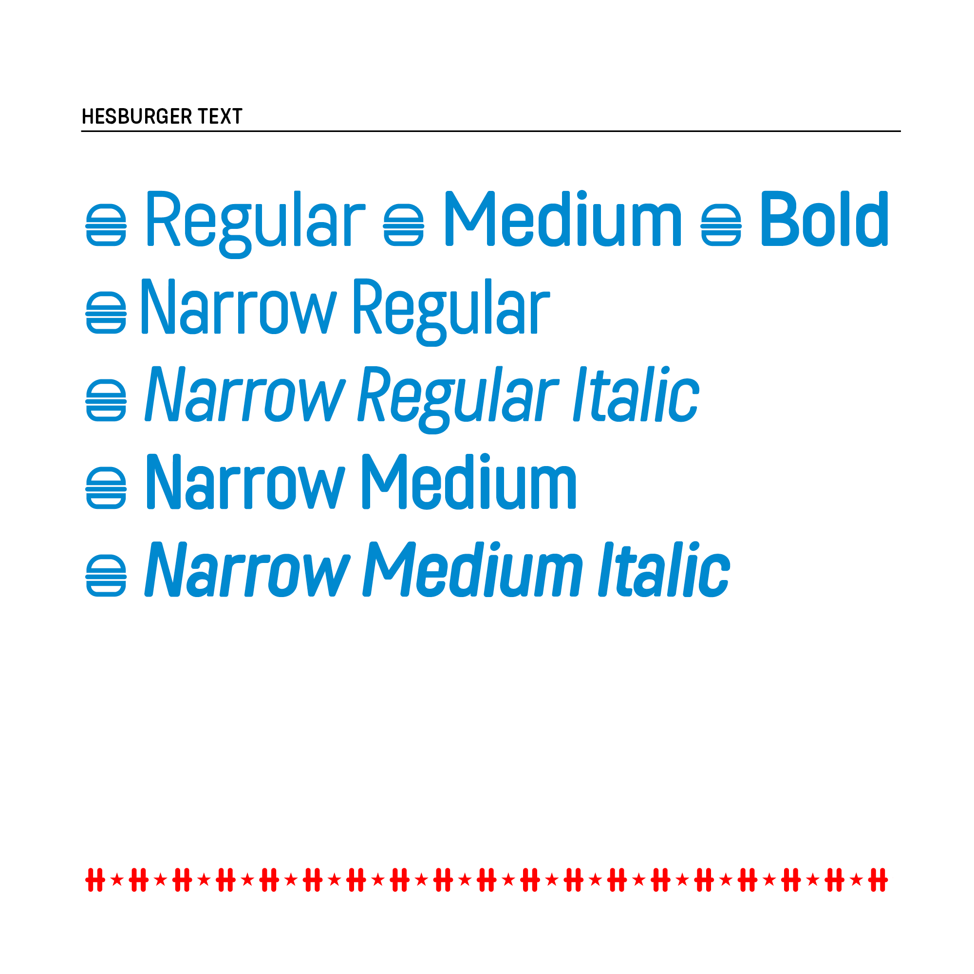
A tailor-made custom typeface family completes Hesburger’s signature look. The family includes display and text styles, extensive language support and numerous Open Type features.
By going back to basics, we were able to lean into the best aspects of burgers – they’re simple and fun!

Bespoke typefamily
A tailor-made custom typeface family completes Hesburger’s signature look. The family includes display and text styles, extensive language support and numerous Open Type features.
Credits
My role: Creative director, type designer
Agency:
Pentagon Design
Designer, art director, motion design: Vesa Viljakainen
Client & Project lead: Tuomas Rentola
Photographer: Fanny Halén / Fotonokka